Examples of Successful Content Clusters in Different Sectors
We’ve discussed what topic clusters and pillar pages are, why they’re important for search engines, and how you can implement your own, but now let’s explore some of our favourite examples of the topic cluster model.
We asked our colleagues and people with industry expertise to let us know their favourites within the education, health, finance and tech sectors. What do they like about them? What sets them apart? Is it the quality content? The intelligent approach to internal links? Or something else entirely?
But, before we get started, we’ve recently created a video discussing some of these great topic cluster examples. So if you prefer to watch rather than read, here it is:
Now, let’s get started exploring our favourite topic cluster examples.
Education Topic Cluster Examples
I Want To Learn Japanese
We start with one of the most comprehensive topic clusters we’ve ever seen. I Want to Learn Japanese from Tofugu.

By their own admission, the guide is “over the top” but if you’re looking for an example of an extensive topic cluster, it’s hard to beat. What’s more, it preps the user right at the start, to help prevent them from becoming overwhelmed by the scale of it, and warns them that some of the processes might not seem right on first read. Tofugu’s stated goals are:
“to reach Japanese fluency as directly as possible. Unlike a teacher or a textbook, we have the freedom to be ruthless in the path we take to get there.
There are no tests or quizzes to take. You don’t have to move at the speed of the slowest learner in your group. All you need to do is follow each step, do the work, and progress.
Just keep in mind that because of this, some steps may seem counterintuitive. They may even seem slow compared to other methods, but everything has been carefully selected to get you to the finish line faster and more efficiently. We’ll talk more about that later.”
The table of contents at the top of the page allows users to easily navigate the text and the fact it’s broken up with key quotes, images and clear links to other content means it never feels as overwhelming as it could.
How to Start a Podcast
How to Start a Podcast from Buzzsprout is a much simpler and digestible education topic cluster compared to Tofugu, but it’s no less comprehensive.
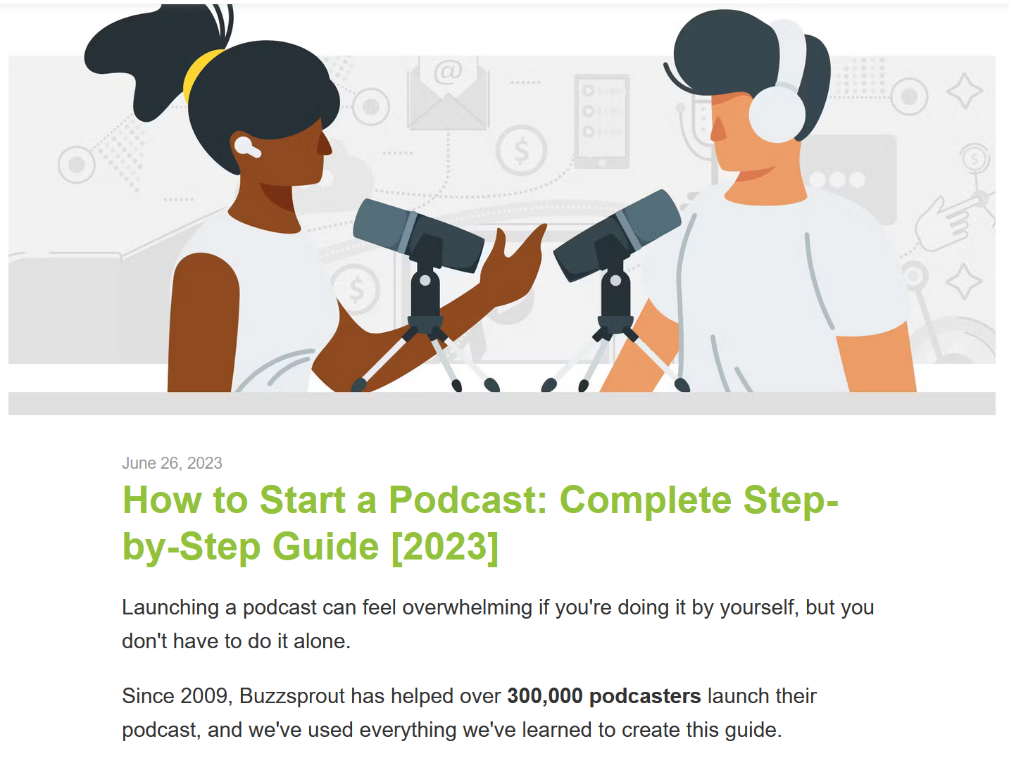
Although it covers a huge topic, this topic cluster is broken down into 10 easy steps that follow a logical and simple process as part of an online course. What’s more, each section is broken down into bullet points and short, snappy sentences that make it easy to digest. Images and video content further information at a glance. As you’d expect, each section links through to a more in-depth guide.
Tech Topic Cluster Examples
What is a Chatbot? The Ultimate Guide
Drift has created the Ultimate Guide to Chatbots as part of their Learn section, and we think it’s a great topic cluster example, especially when it comes to converting users.
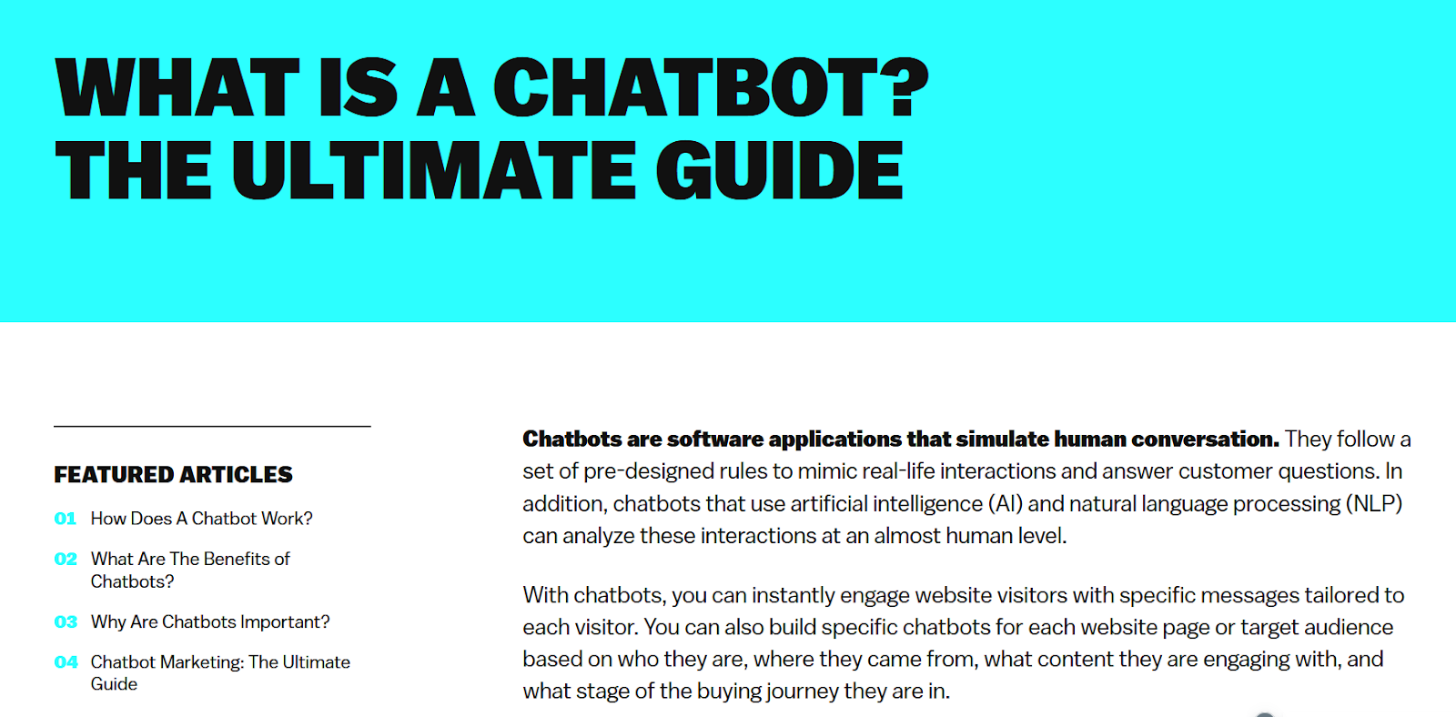
Not only do we love the formatting and the style of it, but we also like the sticky navigation on the left-hand side and the clear CTAs throughout the copy. This is a fantastic example of strategic internal linking.
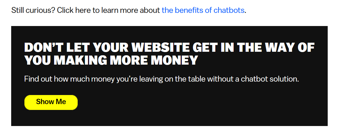
Despite providing a chatbot service themselves (which they integrate well into this cluster), Drift don’t shy away from discussing their competitors and what they do well. This builds trust in the content and shows that it’s not purely for promotional purposes, but to genuinely educate their users. It shows they’re confident enough in their own product to let it stand against competitors.
The final flourish? Offering a clear link to their ROI tool at the bottom of the copy that shows prospective customers how much money they may be missing out on by not using their tech. What’s more, Drift have excellent internal linking to the main cluster pillar page, which gives it plenty of prominence on the site and makes it easy for search engines to find and crawl it. For example, the pillar page has 109 internal links pointing to it, largely from relevant satellite blog posts and guides. So in the case of Drift, their topic cluster looks more like this:
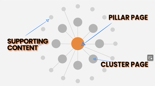
This effectively makes it even larger and creates a complex structure of interlinked pages across the entire website that effectively demonstrate their knowledge and expertise on the subject.
Search Engine Journal: Link Building Guide
The sheer scale of Search Engine Journal’s Link Building Guide Topic Cluster is something to behold.

With 50 sub-pages, each very meticulous, well-presented and incredibly useful to a reader, it shows that there is no limit on what can be done with a topic cluster strategy. Search Engine Journal is well-known anyway as an authority on everything SEO, SEM and Digital Marketing, but it’s no wonder that this particular example managed to secure Featured Snippets for multiple, short tail and high search volume keywords.
From a technical perspective, perhaps unsurprisingly, it’s also very good. The use of breadcrumbs and in-copy internal links with contextual anchor text gives search engines no doubt as to what it is about. Like the Drift example above, they also link to it from other informational pages, ensuring it isn’t silo’d on the site. We don’t know whether this was envisioned as an eBook first or second, but the sheer quality and scale of it makes it a great tool for lead gen as well.
CoSchedule: What is Marketing?
Like the Search Engine Journal example above, CoSchedule has chosen a broad topic for this extensive topic cluster, and they’ve made it work.
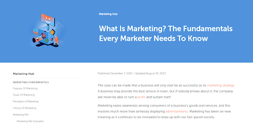
This topic cluster makes great use of the sticky menu on the left and jump links make it easy for the user to navigate what is, in reality, a big piece of content. We like how simple yet effectively the information is presented, and how they make a big subject very digestible.
Health Topic Cluster Examples
The Atlantic: Population Healthier
If there’s a prize in this list for memorable design, usability and engaging content then Population Healthier from The Atlantic must surely win it.
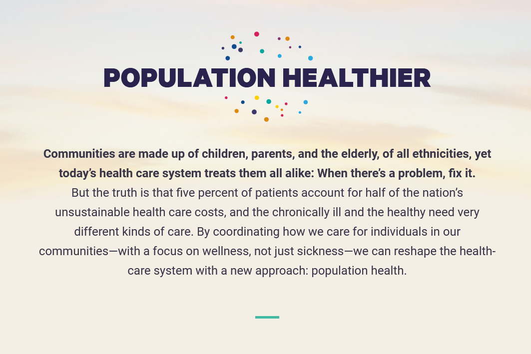
We love how the various graphics, charts, videos, maps and diagrams move in and out as the user scrolls, and how seamlessly the related information and links are presented. It really tells the story and brings it to life, while still communicating all the key information for the user.
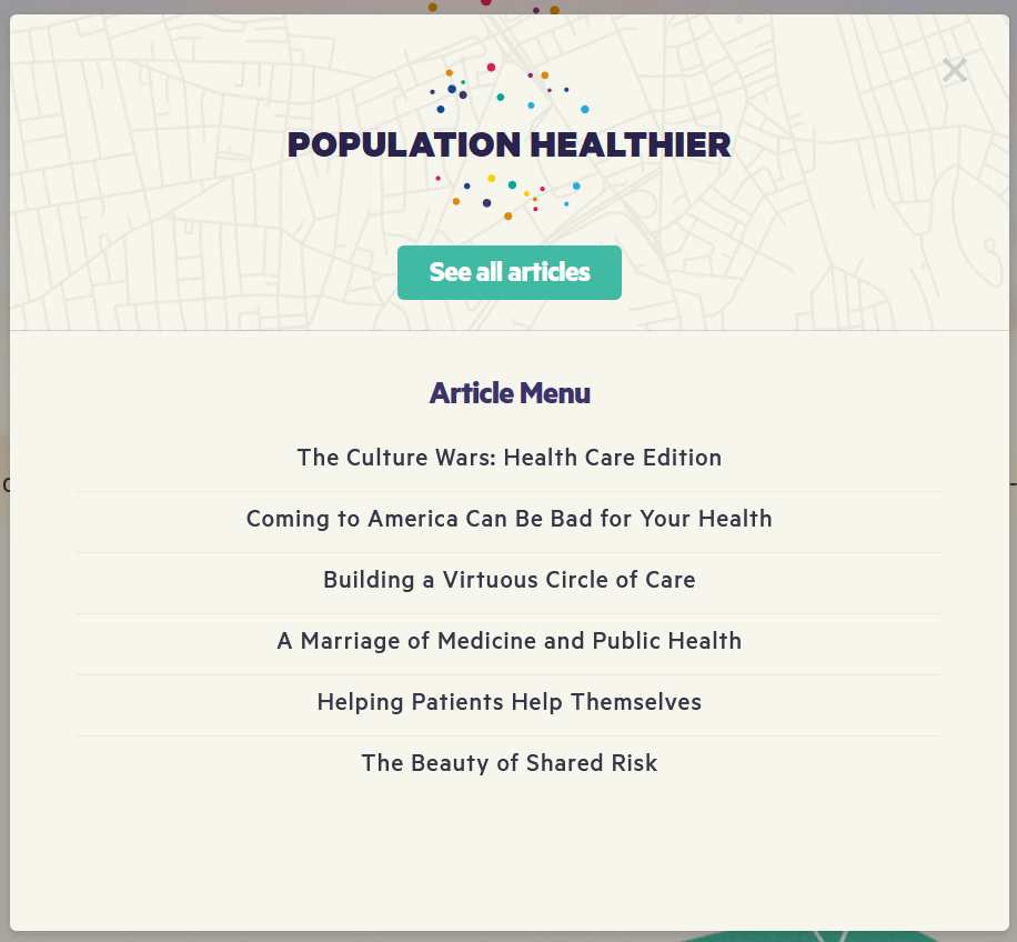
Additionally, we also love how the sticky Article Menu on the left allows the user to bring up the main nav regardless of where they are on the page:
For more information about topic clusters, including how to create them and the strategy behind it explore our other cluster pages below.